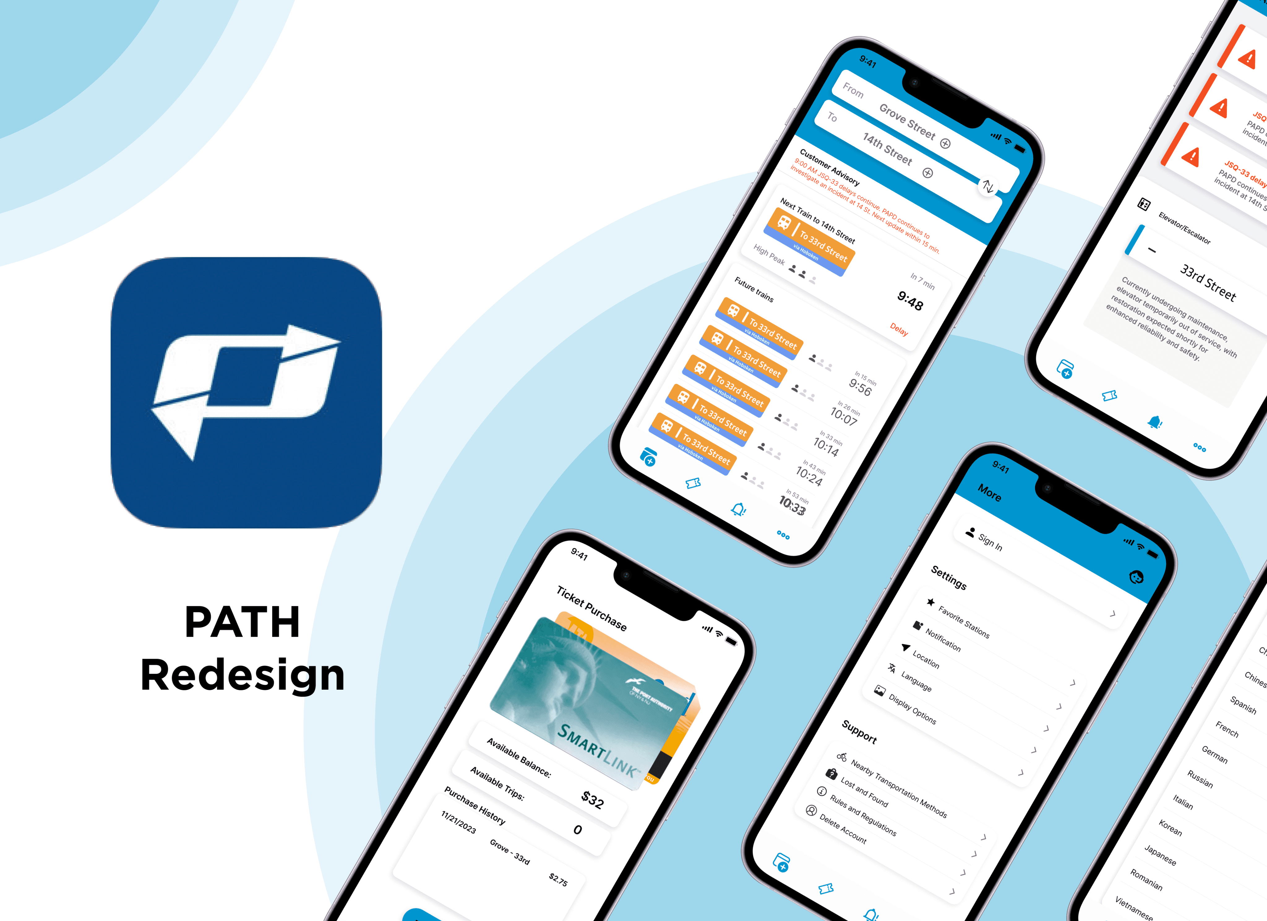
The PATH app redesign project aims to transform the user experience for commuters by addressing current pain points and enhancing the overall functionality and usability of the application. Focused on creating a more intuitive and user-friendly interface, the redesign will prioritize improvements in navigation, ticketing processes, and real-time updates to ensure a seamless and stress-free journey for users. Through a thoughtful and comprehensive redesign, the goal is to create a modern and efficient PATH app that meets the diverse needs of commuters while providing a visually appealing and engaging interface.
The PATH app redesign project aims to transform the user experience for commuters by addressing current pain points and enhancing the overall functionality and usability of the application. Focused on creating a more intuitive and user-friendly interface, the redesign will prioritize improvements in navigation, ticketing processes, and real-time updates to ensure a seamless and stress-free journey for users. Through a thoughtful and comprehensive redesign, the goal is to create a modern and efficient PATH app that meets the diverse needs of commuters while providing a visually appealing and engaging interface.
The PATH app redesign project aims to transform the user experience for commuters by addressing current pain points and enhancing the overall functionality and usability of the application. Focused on creating a more intuitive and user-friendly interface, the redesign will prioritize improvements in navigation, ticketing processes, and real-time updates to ensure a seamless and stress-free journey for users. Through a thoughtful and comprehensive redesign, the goal is to create a modern and efficient PATH app that meets the diverse needs of commuters while providing a visually appealing and engaging interface.
Project Overview
The Product
The Product


Research Findings
What’s the current problem?
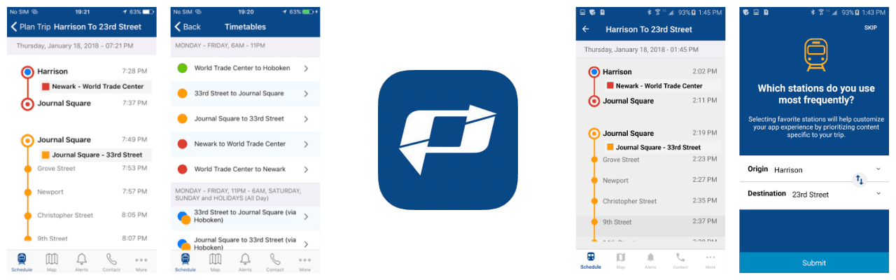
As a NYC student, I live in Jersey City for peace and quiet. PATH is one of our most frequently used transportation to commute to Manhattan. It is a subway that connects areas of Hoboken, Jersey City, Newark, and to mid-town Manhattan. It is relatively new compared to NYC MTA transportation system.
The current design presents challenges in user interaction and usability, creating a less-than-optimal user experience.
Initial Interviews
“It doesn’t give information of the status of train directly. Makes us wait at the station for no reasons.”
“It is highly annoying when I can’t purchase ticket through the app. Surely there’s no tap and go like MTA”
“The hierarchy of information is confusing.”
“It doesn’t give notifications of train or station status.
Too many times when I have gone to train station to find
out it’s delayed or the station is closed.”
“I frequently need more than two stations depending on the time of the day I work. It limits me to 2 favorite stations.
But I need more most of the times.”
“I wish the Smart Link card can be linked to the app. It automatically provides tap and go for tickets.”
Research Findings
What’s the current problem?
As a NYC student, I live in Jersey City for peace and quiet. PATH is one of our most frequently used transportation to commute to Manhattan. It is a subway that connects areas of Hoboken, Jersey City, Newark, and to mid-town Manhattan. It is relatively new compared to NYC MTA transportation system.
The current design presents challenges in user interaction and usability, creating a less-than-optimal user experience.
Initial Interviews
“It doesn’t give information of the status of train directly. Makes us wait at the station for no reasons.”
“It is highly annoying when I can’t purchase ticket through the app. Surely there’s no tap and go like MTA”
“The hierarchy of information is confusing.”
“It doesn’t give notifications of train or station status.
Too many times when I have gone to train station to find
out it’s delayed or the station is closed.”
“I frequently need more than two stations depending on the time of the day I work. It limits me to 2 favorite stations.
But I need more most of the times.”
“I wish the Smart Link card can be linked to the app. It automatically provides tap and go for tickets.”

Insights From Current Problem
The hierarchy of information displayed is not user-friendly. Should highlight more important info and shrink down some unnecessary ones.
There are multiple redundant and distraction information that confuses the user through navigation process.
Limited selection of stations. Causes the user unable to get full access with efficiency. It creates an obstacle for user.
Information Hierarchy a Mess
Limited Personalization
Redundant and Distraction Information
The app does not offer a clean and visually appealing aesthetic. It increases cognitive load for users because it is not organized for better navigation.
Poor Visual

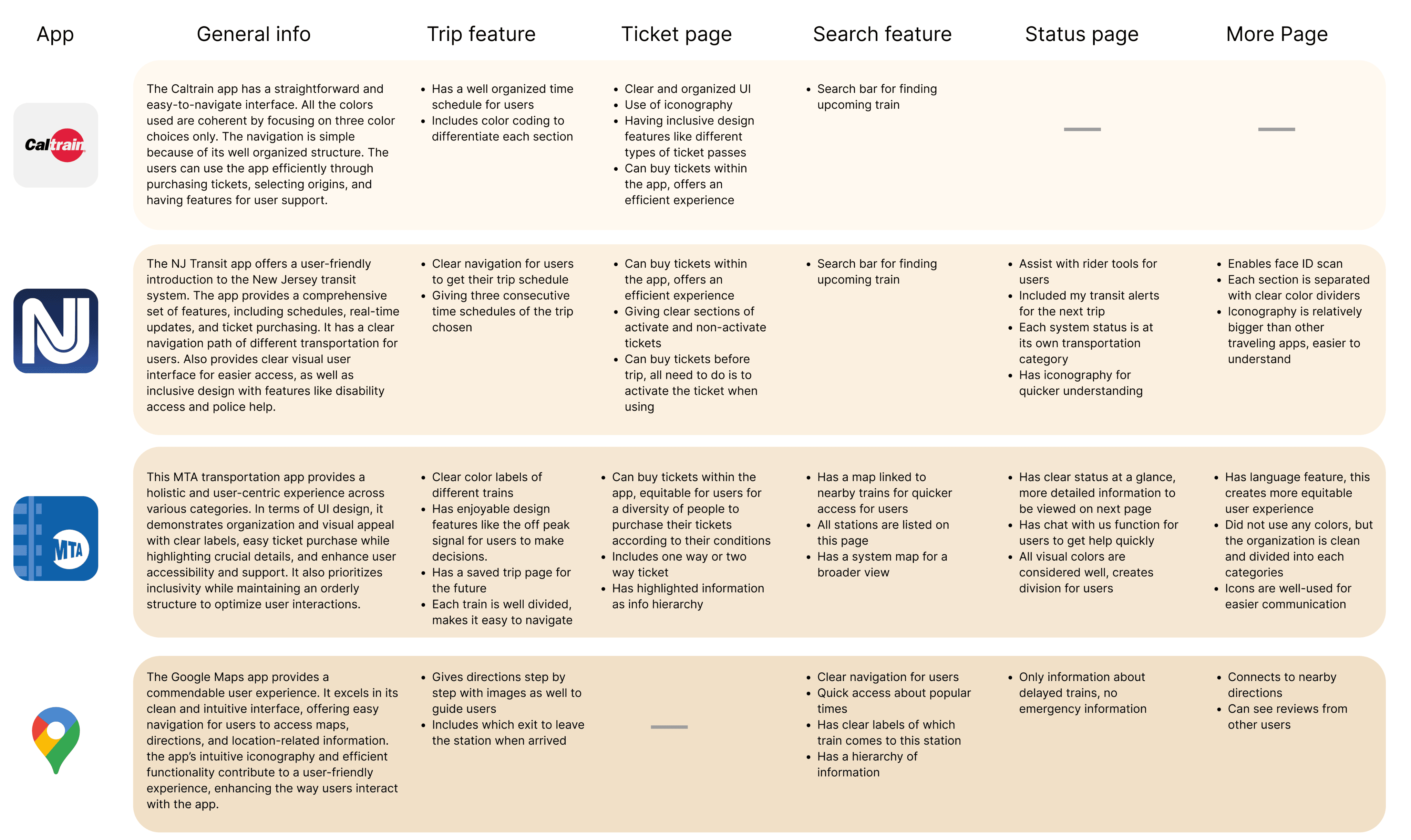
Competitive Analysis
Before initiating the design phase, a thorough competitive analysis was undertaken to evaluate popular transportation apps comprehensively. The examination focused on discerning the strengths, weaknesses, and distinctive features of these apps.
Competitive Analysis
Before initiating the design phase, a thorough competitive analysis was undertaken to evaluate popular transportation apps comprehensively. The examination focused on discerning the strengths, weaknesses, and distinctive features of these apps.
Competitive Analysis
Before initiating the design phase, a thorough competitive analysis was undertaken to evaluate popular transportation apps comprehensively. The examination focused on discerning the strengths, weaknesses, and distinctive features of these apps.
Persona
Age: 20
College Student
Luna Green
Story:
Luna is a college student living in Jersey City. She commutes daily to her university in Manhattan using the PATH train. She is always on her phone and relies on the PATH system to get to her classes on time. She is familiar with the schedules and station locations, and she uses the PATH app to check real-time updates. Luna values efficiency and reliability.
Goals and Needs:
Timely arrival to classes
Easily accessible real-time updates and ticket purchases via the app
Convenient route planning for trips
Pain Points:
Need for reliable and quick access to real-time updates
Crowded trains during rush hours
Connectivity issues with unstable internet in stations
Unexpected delays and issues with train


Age: 35
Work From Home Professional
Mark Smith
Story:
Mark works from home as a software developer and only occasionally needs to travel to NYC for in-person meetings or events. He has a flexible work schedule and doesn’t use the PATH train regularly. As an infrequent user, he is not familiar with the PATH routes or station locations, and have limited knowledge of the app. He is from Korea and sometimes need a little bit of translation with Korean. He values simplicity and ease of use.
Goals and Needs:
Efficient navigation of PATH app
User-friendly app to purchase tickets without confusion
Clarity on schedules and train options during infrequent travel
Avoiding unnecessary delays or complications during the commute
Pain Points:
Lack of familiarity with the PATH system
Uncertainty regarding ticketing and schedules
Potential frustration with navigating an unfamiliar app
Lack of language support within the PATH app
Development
Persona
Age: 20
College Student
Luna Green
Story:
Luna is a college student living in Jersey City. She commutes daily to her university in Manhattan using the PATH train. She is always on her phone and relies on the PATH system to get to her classes on time. She is familiar with the schedules and station locations, and she uses the PATH app to check real-time updates. Luna values efficiency and reliability.
Goals and Needs:
Timely arrival to classes
Easily accessible real-time updates and ticket purchases via the app
Convenient route planning for trips
Pain Points:
Need for reliable and quick access to real-time updates
Crowded trains during rush hours
Connectivity issues with unstable internet in stations
Unexpected delays and issues with train
Age: 35
Work From Home Professional
Mark Smith
Story:
Mark works from home as a software developer and only occasionally needs to travel to NYC for in-person meetings or events. He has a flexible work schedule and doesn’t use the PATH train regularly. As an infrequent user, he is not familiar with the PATH routes or station locations, and have limited knowledge of the app. He is from Korea and sometimes need a little bit of translation with Korean. He values simplicity and ease of use.
Goals and Needs:
Efficient navigation of PATH app
User-friendly app to purchase tickets without confusion
Clarity on schedules and train options during infrequent travel
Avoiding unnecessary delays or complications during the commute
Pain Points:
Lack of familiarity with the PATH system
Uncertainty regarding ticketing and schedules
Potential frustration with navigating an unfamiliar app
Lack of language support within the PATH app
Development
Journey Map
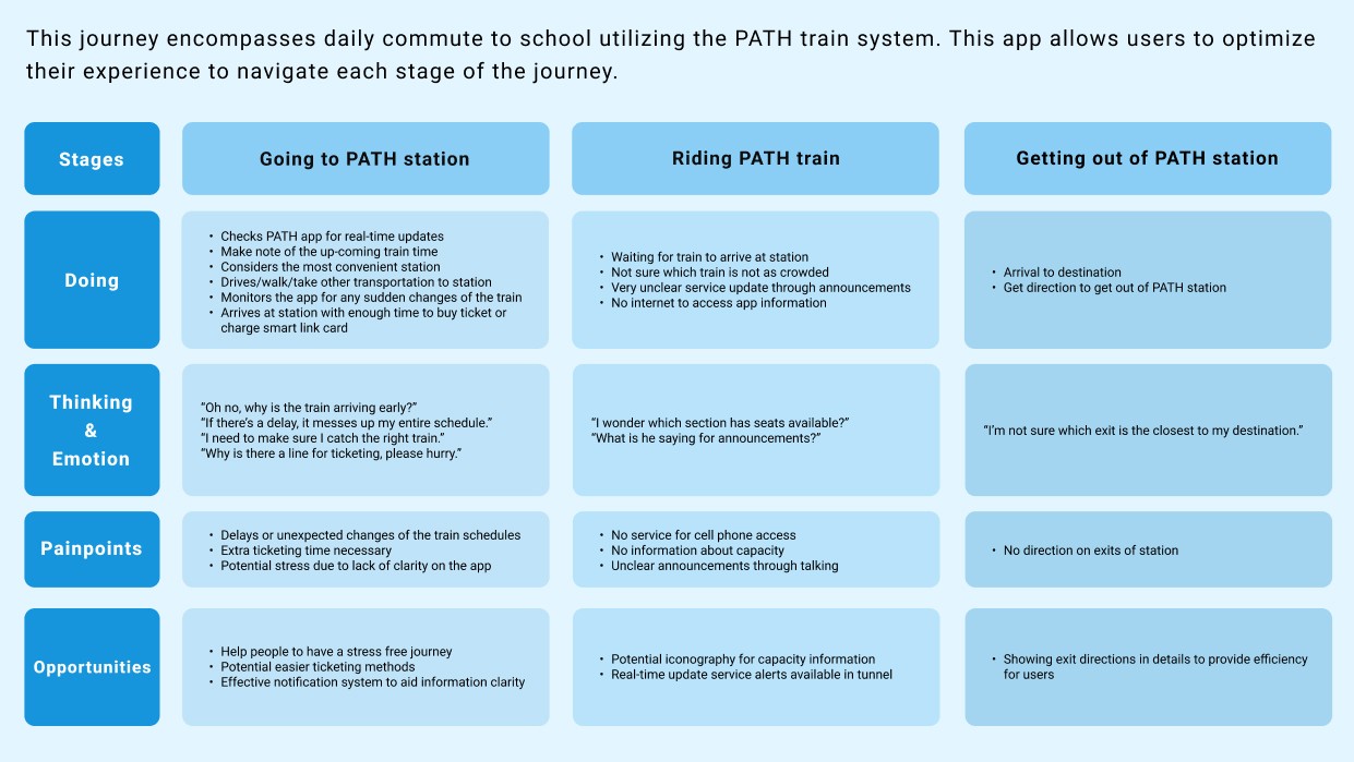
Journey Map
Journey Map
Insights
Pain Points
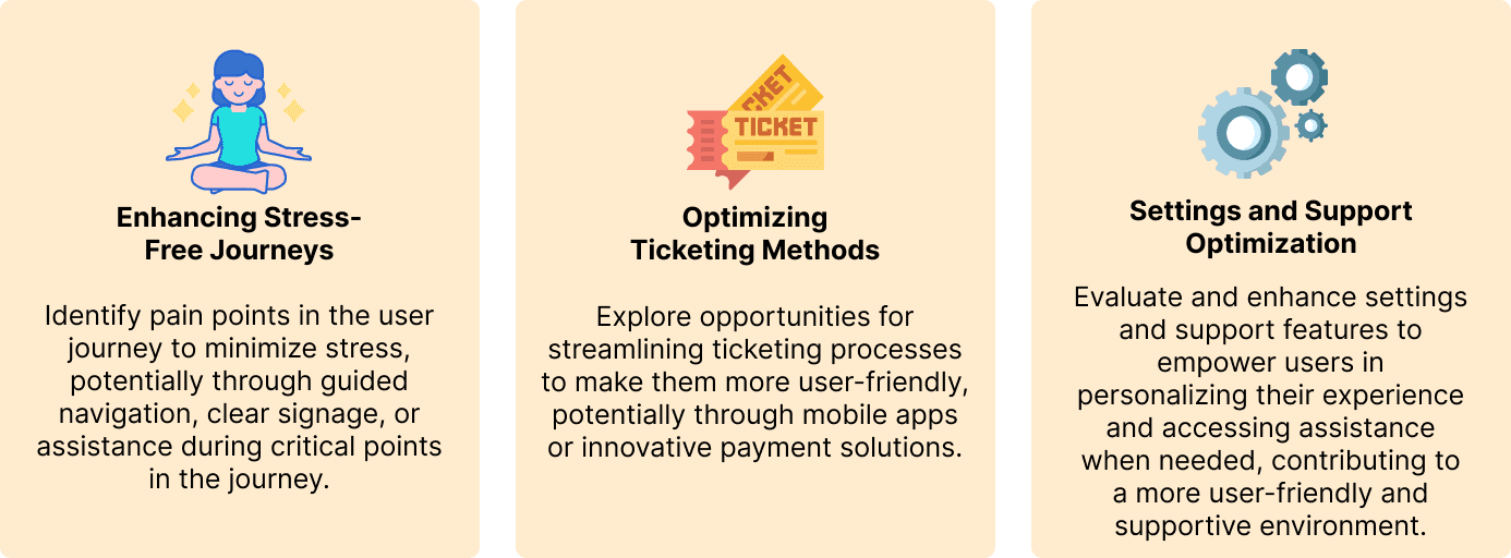
How may we streamline the PATH app to maximize user convenience, alleviate commuter stress, and improve overall satisfaction?
Information Hierarchy Not Clear
Highlights challenges in organizing and presenting information within the PATH app, leading to user confusion and difficulties in locating essential details
Inconsistent Information Architecture
Users may encounter difficulties in understanding the relationships between different features, leading to confusion and a less-than-optimal user experience.
Ineffective Ticketing Process
This issue can lead to user frustration, hindered transaction processes, and an overall suboptimal user experience.
Unintuitive Alerts & Notifications
Challenges users in receiving and comprehending alerts. Have trouble finding actionable information, leading to potential disruptions and a diminished overall user experience.
Limited User Support
This issue can lead to user frustration, hindered transaction processes, and an overall suboptimal user experience.
Issues With Offline Functionality
Users may experience disruptions, inconvenience, and a lack of critical information during periods without an internet connection.
Insights
Pain Points
How may we streamline the PATH app to maximize user convenience, alleviate commuter stress, and improve overall satisfaction?
Information Hierarchy Not Clear
Highlights challenges in organizing and presenting information within the PATH app, leading to user confusion and difficulties in locating essential details
Inconsistent Information Architecture
Users may encounter difficulties in understanding the relationships between different features, leading to confusion and a less-than-optimal user experience.
Ineffective Ticketing Process
This issue can lead to user frustration, hindered transaction processes, and an overall suboptimal user experience.
Unintuitive Alerts & Notifications
Challenges users in receiving and comprehending alerts. Have trouble finding actionable information, leading to potential disruptions and a diminished overall user experience.
Limited User Support
This issue can lead to user frustration, hindered transaction processes, and an overall suboptimal user experience.
Issues With Offline Functionality
Users may experience disruptions, inconvenience, and a lack of critical information during periods without an internet connection.
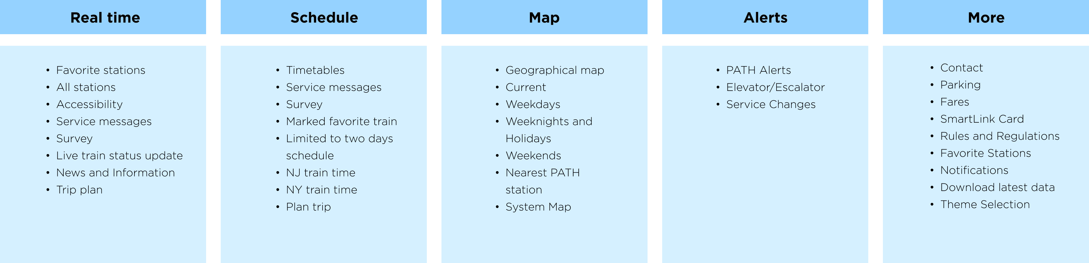
Original Information Architecture
Information Architecture
Insights from Information Architecture Analysis
Based on an analysis of the current features, strategic insights have been derived to inform further enhancements and optimization for an improved user experience.
Following the evaluation of the current information architecture, a card sorting exercise is underway to iteratively organize and refine the user interface, ensuring optimal user navigation and engagement.
Users think map and alerts don’t exhibit any noticeable issues; however, their feedback suggests potential concerns or areas for improvement in other aspects of the application’s features.
Solutions
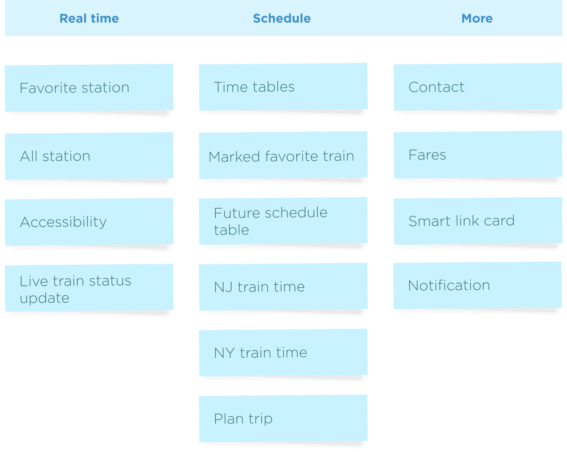
Updated Information Architecture
Wireframe


Updated Information Architecture
Wireframe
Updated Information Architecture
Wireframe


Project Overview


© Tiffany Hu 2024
© Tiffany Hu 2024
